
Archive for April, 2006
Posted by Arne in General DRL - April 2nd, 2006
Testing some ideas combining D and R, I think I like 2 the best out of these.
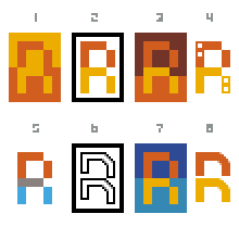
 Edit: Another variant
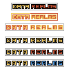
 Har jag närt en KOMMUNIST vid min barm?!?
 Should be a bit fatter maybe…
 …like this?
–
[DT edit] Or this?


I think the merged D-R insignia gets a little too abstract… will probably be hard to get people to make the connection in their heads to the words Data Realms. Why not just keep it clear and pixel-clean?
–
[Arne edit] Maybe, but on the other hand logos are supposed to be rather abstract simplifications because you don’t want to type out the entire thing.

[DT Edit]

mmm?
[Arne edit:] Umm? Thinner on the left.
