
Author Archive
For a long time now, Cortex Command has been stuck with the lonely Crab as the only Fauna on the planet. The Flora has been pretty sparse too.

Cortex Command Rough concept art for indigenous life
The basic idea behind these concepts are that a mass extinction took place long ago, with the crab and a type of plant being the only survivors. The fossilized creatures were the ones which drew the short straw of course. With no competitors around, the crab and plant quickly evolved and diversified.
(Note: this is just a sketch-up of some ideas, and isn’t a guarantee of future gameplay elements. That goes for any art I post on this blog, too)
What about the gameplay though? Currently, the (or a) plan is to have different pacing with more action oriented segments, and some calmer segments with more of the indigenous life. It would be a nice feeling to arrive at a new site, finding a new life form (and poke it around a bit). The question is how quick the few lifeforms I’ve drawn above will get old, and if I need to vary the shapes and color a bit more too keep things exciting. Is it boring to just have different types of crabs, or should we go nuts with many different species? I’d like to think that it’s possible to vary the crab design enough to fill the niches we need to fill. Using wildlife derived from crabs also gives Cortex Command a clear identity.
While the regular plants are just terrain objects, the hostile ones would probably have to be special actors. We have thought about trees, but it might be best to put those in the background. It would probably feel wrong if they were static terrain pixels. They could be some special kind of actor. A palm tree for example could have a trunk spine of little… chunks, and flimsy leaves which could be shot to pieces.

A dropship crashing down in a group of trees could bend the trunks (which could snap if a certain tolerance is exceeded). It would look spectacular, in theory. In reality it might be hard to get it to feel right, and it takes valuable time to implement. Another worry is that trees will crowd up the terrain too much and that too many actors would end up walking into trees and hang or ‘explode’ (wait, did we fix that yet?).
So, well, those were my thoughts on that. I wrote a bit too much about trees. I think I’m supposed to end this pose with a question mark, to stimulate discussion. Instead I used it to highlight a bug which has proven difficult to crush. That’s not the way to do it, so I’ll have another go at it.

Coalition Military Forces (playing with styles)
What do you guys think about the proportions of the Cortex Command humanoids? More specifically, I’m thinking about the head size and foot size. When I was younger I thought big feet and big hands were really awesome. Lately I’ve been moving the focus away from the feet and legs, up to the torso where I feel the interesting parts are. For me, feet are not the most interesting part of a design. Long mecha toes are alright, but putting a lot of the (design) mass into the foot and lower leg seems like a waste unless you’re designing a toy which is supposed to be standing up. Humans get fat around the belly because it’s the center of mass. Imagine trying to move around if all of your fat was centered around the wrists and ankles! (On the plus side, you could wear blue spandex and cosplay as Megaman.)

Fight, Proto-clone, for everlasting gold!
Anyways, I had a fleeting thought about reducing the foot size a bit, and maybe (but probably not) play around with the head size some. The actual foot graphics are separate from the ground collision mechanic, so it can be just a graphical tweak. I mention this because I don’t like drawing pinups of the Cortex Command characters with huge ‘Goofy’ feet, even though they bother me less when seen ingame. It would be nice if the promo art matched the actual ingame graphics though.
Testing some ideas combining D and R, I think I like 2 the best out of these.
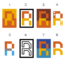
 Edit: Another variant
 Har jag närt en KOMMUNIST vid min barm?!?
 Should be a bit fatter maybe…
 …like this?
–
[DT edit] Or this?


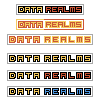
I think the merged D-R insignia gets a little too abstract… will probably be hard to get people to make the connection in their heads to the words Data Realms. Why not just keep it clear and pixel-clean?
–
[Arne edit] Maybe, but on the other hand logos are supposed to be rather abstract simplifications because you don’t want to type out the entire thing.

[DT Edit]

mmm?
[Arne edit:] Umm? Thinner on the left.
